
Here is bit of eye candy
I don’t have clue, what language this blog is in but its has pretty pictures of typography on vintage tins. I figured itwould be nice of me to share. Enjoy.
RobertMichaels Bilder – Galerie @ Die Online-Community zu Schrift und Typografie.
Typewatch: Archer

Worki ng in a bookstore I come across a lot of book cover designs. I’ve noticed quite few trends, some interesting, some not so much. Recently, I’ve noticed publishers acquiring an affection for Hoefler & Frere-Jones’ Archer font, a slab serif with a splash of personality. You can see it on the US publication of “Just My Type” by Simon Garfield and most recently the paperback format of Katie Couric’s “The Best Adive I Ever Got”. Some say Archer is the new black and why not? It carries a simple no nonesense appearance but the rounded terminal give it a hint of class. The font is also available with Old Style (of which I am a fan) and Lining numerals. Test drive the font.
But There Some Good Free Fonts

A Creative Alternative to Free Fonts: Part 2 will be coming soon. I wanted to put together a tutorial to put a creative plan into action. Bare with me because I’m in my last semester of school and the workload is hectic, to put it lightly. In the meantime, a classmate asked me to post what I knew about some good free fonts. I am not against free fonts that are given by the author so here a couple of good places to find good quality free fonts that the creator has given to the public. Keep in mind, even some free font have stipulations when you start using them for commercial purposes. Out of appreciation and respect for our fellow designers, please adhere to the license agreements.
There are quite a few cool fonts here. One of my favorites is Museo. Three weights are available for free. If you go to MyFonts, you can get the web font as well. I used the web font for my portfolio site and it came out nicely. Museo is missing some ligatures so you will have to add -moz-font-feature-settings: “liga=0” to the “MyFonts” css file, otherwise you may have missing letters when your text is rendered.
This site offer free fonts and some really nice fonts for purchase. Soupirs is on my wishlist (in case anyone is feeling generous).
Gentium is an Open Font License. Read more about Open Font License here.
Other free fonts:
- Dream Orphans and the Larabie fonts
- League Gothic
A Creative Alternative to Free Fonts

Being a typophile, I enjoy shopping for fonts. I tend to prefer purchasing á la carte but free fonts are my favorites, of course. However, there are drawbacks to downloading free fonts. If you have ever read the license agreement, which you should, free fonts often come with limits on the usage. Most free fonts are for personal use only. In addition to usage to limits, the quality is often questionable, requiring no small amount of kerning in order to make the the text readable.
A creative alternative would be to design your own typeface. Keep in mind, I did not say font. A font is the software used to deliver a typeface. Aside from that snippet of information, I know nothing of developing fonts. While fonts may require more education than an understanding of a drawing software like Adobe Illustrator, creating a few letters in place of a display font is completely within most designer’s abilities. The feature image is an exercise I’m trying creating an alphabet using only squares, circles and triangles.

Futura Condensed Bold filled with a line pattern.
I found this blog very informative and relevant to those of us going into the design industry. Read it and Happy Hunting!

As the school year comes to a close, I’m forced to realize the next critical step in becoming a professional graphic designer is approaching VERY quickly: Job Interviews… Eek! Rather than panic (too much) about my upcoming opportunities, I chose to search the web for tips on how to proceed down this path. I came across this really helpful website that outlines the 15 best tips for entering into a graphic design-oriented job interview written by Lee Newham, founder of Good People, and former design director at London-based Davies Hall.
15 Graphic Design Interview Tips
- When you arrive in the interview give us your business card. It should be well designed, memorable, simple and hopefully have a great idea. It should be unique and you should be branded.
- Have 8–12 pieces of work in your folio. Put the best pieces at the front and back.
- Have at least six questions…
View original post 398 more words
Graphic Design Newsletter
 Typography rules! It is rooted in my affection for graphic design. I feel like it is one of the most important aspect of graphic design but it does not stand by itself so I would like to explore and inform about the world of graphic design and not just typography. For organization sake and to demonstrate good typography I am starting a newsletter. The newsletter will feature all things graphic design: typography, branding, print, illustration, web design, product reviews and book reviews. In addition to typography, I also enjoy history and working in Adobe Illustrator. I have decided to share my explorations with you through my newsletter. Subscribers will not only receive a monthly newsletter. If you subscribe, you will receive exclusive vector art and stock photos I have created. I also have a collection on quotes from creative minds: past and present. Subscribe to my newsletter today!
Verdana

I am going to start a typeface series. Once a month, I will talk about a typeface: new, old, serif, sans-serif, display, good, bad. This month, I though Verdana would be fitting because Matthew Carter and Roger Black are coming to the Michigan Theater on March 8, 2012.
Verdana was designed by Matthew Carter for Microsoft. Microsoft wanted a font that would be readable at small sizes on a computer screen. Carter had already proved his ability to design a typeface to meet specific needs with Bell Centennial. Verdana has a very large x-height an attribute that grants readability.
Of the default fonts able to users on the web, Verdana is my favorite. I like the proportions of the letter-width and the x-height. Verdana is simple with a touch of class. It’s not too rigid or too ornate. I look forward to the listening to Matthew Carter and Roger Black speak on March 8 at the Michigan Theater.
Create 3D Letters

Last summer, Computer Arts Magazine released a special issue exclusively for Adobe Illustrator software. The issue is overflowing with tips on how to harness the power of Illustrator. It also a few interesting profiles of designers showcasing their work. I have been enjoying this issue for a few months and I decided this week I would share a few of my results from a tutorial I did and encourage others to try it as well.
The first step requires you to make an isometric grid. I promise it sounds harder that it is. I have included a link of how to do this in Illustrator. Next you will create all eight sides of your cube by tracing them in the grid. It will be easier to do if you set your fill to none. It should look something like the second image. After you construct your cube, I suggest making a copy. Select one whole cube and group it. This makes it easier to move and nudge your cube if you need to.
The tutorial made the letters look more building-like which was very cool. I say have fun with it and do what you want. I started with my initials. If you’re not used to working with grids, they can be really annoying but you need them to make your letters look 3D. I suggest making the grid a little bigger. You can always move your constructed letters off the artboard to make room for more cubes. I also changed my guides from the default light blue lines into light red dots.
Have fun and feel free to post your results!


Fantasy Landscapes and an Enchanting Typeface
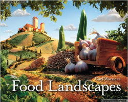
 In 2010, Abrams Harry published this appetizing collection of food landscapes. Carl Warner is the author and photographer. When I first saw this book, I was first drawn to the typeface. Zuzana Licko’s Mrs. Eaves. I’ll come back to the book but let me first say I love, love, love this typeface!!! Licko designed Mrs. Eaves in 1996. It is a transitional serif inspired by the Baskerville typeface. The strokes are elegant and ligatures make my heart sing!
Back to the book. Carl Warner created some luscious landscapes made entirely of food. Each page is a foodie heaven and the body text is Mrs. Eaves as well, sans ligatures. There is a broccoli forest, a sea of red cabbage, and scene reminiscent of surrealist painting with a CHOCOLATE door! The combination of delicious food and beautiful typography makes this book a must have for type and food aficionados alike.
Papyrus: The New Comic Sans
![]() Saturday morning, I went to breakfast with a friend. The outside appearance wasn’t impressive but some of the best meals I’ve had have come from places that thought it was more important to to have good food than expensive lighting. The inside was clean, warm and comfortable. The style was traditional. Within a few seconds of being in the restaurant, I knew what to expect.
Saturday morning, I went to breakfast with a friend. The outside appearance wasn’t impressive but some of the best meals I’ve had have come from places that thought it was more important to to have good food than expensive lighting. The inside was clean, warm and comfortable. The style was traditional. Within a few seconds of being in the restaurant, I knew what to expect.
“I bet I can get blueberry pancakes with real blueberries here!”
Yes, I enjoyed blueberries pancakes with real blueberries with bacon, home fries, eggs and coffee. It was everything I expected with the exception of the menu headers in Papyrus. REALLY?!?! I don’t why I was surprised. Papyrus is everywhere. Anything that is supposed to have a natural look warrants the use of Papyrus. Take a stroll through Whole Foods and you will see that tea companies love Papyrus. It is the typeface used for the movie Avatar. The credits for the TV show Medium are displayed in Papyrus. McDonald’s used it to promote their Chipotle BBQ Wrap. You can find it on wedding invitations, church websites, children’s toys.
I will admit that Papyrus has its appeal. I like its proportions and feel of the typeface. When it was released in 1983, it was cool and creative and its textured strokes made it irresistible but now its that song that won’t stop playing on the radio. There are plenty of other typefaces that can meet our design needs and allow us to express our creativity.
 Font Feed
- An error has occurred; the feed is probably down. Try again later.
Typographica
- Comment on FUSE 1–20 by Denis
- Comment on Huronia by John Hudson
- Comment on Huronia by Jim E. Blevins
- Comment on Halyard by H is for Halyard – Nick Simson
- Comment on Typographica is Twenty Years Old by Jai Sandhu
- Comment on Fit by Calcula – Typographica
- Comment on Studio Lettering by Calcula – Typographica
- Comment on Kozei by Mattias Ornberg
- Comment on FF Trixie HD by Stephen Coles
- Comment on FF Chartwell by jalp lakhia
Typophile
- An error has occurred; the feed is probably down. Try again later.
Font Bureau
- An error has occurred; the feed is probably down. Try again later.
